Mobile single-tasking leads the way to a more human friendly desktop

The web seems like somethings everyone should know how to use by now. But what about the less experienced aka the majority of users? Do they really know how to use their browsers? And understand what's going on on their computer screens?
I think computers are still mysterious, magic boxes for a lot of people outside the tech savvy crowd, and we need to keep looking for solutions that can change that perception. Perhaps by learning from simple, easy to use, user centered mobile devices, like the iPad.
The web is a strange place for the average user
As a reader (or occasional visitor) of this blog, you probably have a good basic understanding of how the web works. You're probably familiar with the concept of a web browser and how your browser interacts with web servers to display different web locations. You know how to copy, type and check the URL of a website to make sure you've opened the right web page, and you're probably reading this page in one of the many tabs open in your browser, perhaps even an RSS reader.
But all of the above isn't such an easy task for everyone. If you think the web is easy to use, I challenge you to observe the way so-called "average users" interact with it. Users, who have never received any real training, and are not really interested in understanding how the whole system works. They just want to check their e-mail, share photos on Facebook or find a store's phone number on the web.
I have seem that many times in the past few months (while trying to teach them how to use a pretty complex online tool), and I must say it has changes my perspective. The web just seems like a different place for the average user than it is to me or probably you. It's a place where the Google search box is your starting point because you don't know the URL of your school's website, it's a place where you only use one window at a time (tabs? what tabs?), it's a place full of confusion and notifications you don't really understand. Update? Pop-ups? RSS? Java script? Is that even English?
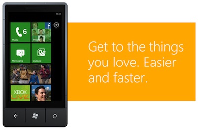
It's just so different from the world we, the tech crowd, live in. It's not a world where the lack of multitasking before iOS 4 was a problem, it's a world where no multitasking is a great feature.
Why do you make me switch windows and apps?
It's certainly something that we should all keep in mind when designing user interfaces and user experiences on the web. You think your registration process, which requires e-mail confirmation, is simple? Think again. The average user doesn't want to switch windows and apps, and doesn't want to read your friendly instructions about activation and other nonsense. They just want to get things done.
 |
| Photo: Microsoft.com |
Let the OS do the work and just enjoy the ride
Many of the features that make current smartphones so pleasant to use, were first introduced by Apple. Of course, a lot of skeptics laughed at the lack of multitasking, physical keyboard and what not, but 4 years after the original iPhone came out, everyone is trying to make a better iPhone. Not a better smartphone per se, but a better iPhone. And even though the geeks love Android for being a more open platform, iPhone keeps setting the standard for the high-end smartphone market.
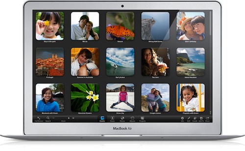
And I think Apple is actually on the right track again with the concept of Mac OS X Lion, the next major upgrade to their desktop OS due to be released this summer. Lion will take a bold step at bringing features from the mobile world - the magic of iPad, as they call it - to the desktop. A unified place to download, buy and update your applications, a launchpad with big, colorful icons, and full-screen apps that take away all the distractions of your desktop.
 |
| Photo: Apple.com |
Mobile devices are changing our expectations
While the emphasis in the discussions about the mobile revolution often seems to be on portability and the business opportunities of mobile apps, let's not forget about how all these mobile devices are changing the way people interact with computers and their expectations.
We are already seeing examples of how the iPad and similar devices are influencing web design, and I definitely think that's a positive trend that will make more and more web destinations feel more natural and uncluttered. Now is the right time to take a look at the web sites we build and maintain, and figure out how to make it more mobile and consequently human friendly.
And the end result will not be something just the less tech savvy users will enjoy; I think we can all benefit from less clutter and distractions. After all, it makes much more sense to have interfaces that adapt to the way people think, than to have people adapt to interfaces they have to use.
Additional readings:
- How iPad Affects the Way we Design Websites? | Inspired Magazine
- 4 ways tablet computing is influencing web design | memeburn
- How the iPad Is Transforming Web Design (case studies) | Mashable
- Apple Previews Mac OS X Lion | YouTube @BNETvideo
